New Photo Album Debut
Well I guess the one good thing about our Florida rain pattern is that it gave me a chance to keep off the motorcycle long enough to start learning how to build my wedding albums "ah la photoshop". In a past blog entry, I got on my soapbox about photographers fees. Well, this is one of those examples. Not only do I have to buy & maintain a PC, but there is the cost of the software, Adobe Photoshop is not cheap. Then comes my time. Some of these pages took me 15 minutes or so and other took 30 to 45 minutes. I'm sure I will get faster with the use of templates and experience. Some albums can be 40 pages or more. But the fact remains that I use my skills and talents to produce a good product for my client. These pages are designed and then placed into a bound album. The old days of just sliding the photograph into a matte sleeve, covered by a piece of clear plastic film, and wired into a album cover are pretty much gone.
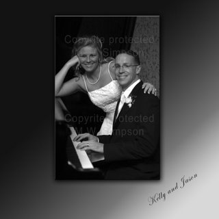
This image is an example of a designed photo album page. I first created the background. Since I decided to make the image a Black & White photo, I used a B&W background. I sized the image to a 5 x7 so it would sit nicely in the middle of the page. This album is utilizing 10 x 10 inch pages. I added the names of the couple for that personal touch. This one didn't take to long.
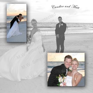
Now this page, which you may recognize the couple from an earlier blog entry, took a little more time.
The sizing of the images is what takes
a while. On this one I took one of my favorites shots of the couple on the beach. Candice had such a great pose. I removed the color from the image and then reduced the opacity and "ghosted" the shot to use it as the background or wallpaper. I then resized 2 other shots and left them in color. Notice that the edges of the color shots are beveled and shadowed to give them some depth. Again, I added their names to personalize the image. This might be a good cover shot, or a page 1, or could just be somewhere else in the album.
Some labs allow you to send the images to them, marked with what page they will be. The lab then takes artistic license to "design" the book. I rather do the design myself. Sure it is time consuming and the customer pays for some of that, but it also lets them have a book that is not a cookie-cutter style. I hope that my clients enjoy this type of presentation of thier wedding images.
Looking forward to Saturday and the Winter Haven Bike Fest. cya!
 into a album cover are pretty much gone.
This image is an example of a designed photo album page. I first created the background. Since I decided to make the image a Black & White photo, I used a B&W background. I sized the image to a 5 x7 so it would sit nicely in the middle of the page. This album is utilizing 10 x 10 inch pages. I added the names of the couple for that personal touch. This one didn't take to long.
Now this page, which you may recognize the couple from an earlier blog entry, took a little more time.

The sizing of the images is what takes
a while. On this one I took one of my favorites shots of the couple on the beach. Candice had such a great pose. I removed the color from the image and then reduced the opacity and "ghosted" the shot to use it as the background or wallpaper. I then resized 2 other shots and left them in color. Notice that the edges of the color shots are beveled and shadowed to give them some depth. Again, I added their names to personalize the image. This might be a good cover shot, or a page 1, or could just be somewhere else in the album.
Some labs allow you to send the images to them, marked with what page they will be. The lab then takes artistic license to "design" the book. I rather do the design myself. Sure it is time consuming and the customer pays for some of that, but it also lets them have a book that is not a cookie-cutter style. I hope that my clients enjoy this type of presentation of thier wedding images.
Looking forward to Saturday and the Winter Haven Bike Fest. cya!

0 Comments:
Post a Comment
<< Home